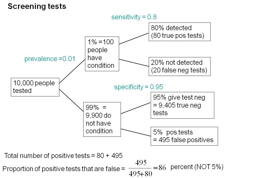
In a blog post earlier this year about medical screening, On the hazards of significance testing. Part 1: the screening problem, statistical expert David Colquhoun demonstrates a simple way of visualizing the structure of certain probabilistic problems. This diagram, which we might call a probability tree, makes the sometimes counter-intuitive solutions to such problems far more easy to grasp (and in the process, helps put over-inflated claims about the effectiveness of screening into perspective).
I discussed exactly this medical screening problem in my first ever technical blog post, The Base-Rate Fallacy (though my numbers were entirely made up, while David's come more-or-less directly from reality). I was therefore extremely jealous of his simple diagram, which conveyed instantly the structure and solution of the problem. How much more direct an explanation than all the words in my earlier blog post.
The problem concerns a medical diagnostic test with certain false-negative and false-positive rates (David's diagram uses the related (complementary) terms sensitivity and specificity). Given that the medical condition under test has a certain prevalence (base rate), what is the probability that an individual receiving a positive test result actually has the disease? It turns out that when the prevalence of the disease is low (often the case), this probability is usually much lower than one imagines.
In David's tree diagram (direct link to the diagram), with a false-negative rate of 0.2, a false-positive rate of 0.05, and prevalence of 0.01, one can clearly see why the desired probably in the case he examined is 14%, rather than the 95% that many people naturally gravitate towards.
Because of the extreme clarity offered by this kind of visualization, I've decided to translate my earlier example into a similar diagram. In my imagined case, we had a far more accurate test, with equal false-positive and -negative rates at 0.001, but also a rarer condition, with background prevalence of 1 in 10,000. To avoid having to think about outcomes for fractions of people, we'll imagine that exactly 10 million people are tested:

This problem represents a fairly simple example of a marginal probability distribution extracted from a hypothesis space over two (binary) propositions: X = receives a [positive, negative] test result, and Y = [has, doesn't have] the disease. In the linked glossary entry, I derive some general properties of such marginal distributions, but as algebra has the annoying habit of often refusing to impress a clear intuitive understanding on our minds, we can use the tree diagram to confirm our grasp on these things.
For example, from the above diagram, we can tell instantly that the overall probability for a person to receive a positive test result is simply 10,998 divided by 10,000,000. What we've done to obtain this number, however, is to implement, without noticing, the same procedure specified by the marginalization formula I derived in the glossary. That formula is:

This just means, to get the probability for x, regardless what y is, add up for each possible value of y, the product of the probability for y and the probability for x given that value of y. This is effectively what the above diagram allows us to do by inspection.
In this case, the y's are the propositions that the subject respectively has and doesn't have the disease. x is the condition that the subject's test result is positive. The overall probability for a positive test result, from the above formula is the sum of two terms. The first of these terms is the probability to not have the disease. i.e. 1 - prevalence, multiplied by P(positive result | subject not afflicted), which is the false positive rate = 0.001. Multiplying these together gives 0.0009999. This is exactly how we arrived at the number in the top right box in the diagram (remember that the numbers in the diagram are multiplied by 10 million).
The second term we need is obtained by similar means, only this time, y = 'does not have disease,' and P(x | y) is now 1 - false-positive rate, giving P = 0.0000999, corresponding to the the top box in the lower half of the right-hand column in the diagram. Adding these together gives P(x) = 0.0010998, corresponding to the top line in green on the diagram.
Another statistical expert with a blog, David Spiegelhalter, has recently used a similar tree diagram to solve a related problem of weather forecasting, here. Part of the success of diagrams like David Colquhoun's diagram (and my copycat graph) is that it lays out a multidimensional problem in a visually accessible way. As David Spiegelhalter explains, another important element is that these diagrams exploit a translation from probabilities to expected frequencies, and back, which eases the workload on our conceptual machinery.
As Spiegelhalter shows, such problems as the medical screening puzzle and his weather forecasting riddle can also be represented using contingency tables. For these 2 dimensional hypothesis spaces over binary propositions, the contingency tables are drawn as 2 by 2 arrays (with totals usually added for good measure). The table for my diagnosis test problem looks like this:
As Spiegelhalter shows, such problems as the medical screening puzzle and his weather forecasting riddle can also be represented using contingency tables. For these 2 dimensional hypothesis spaces over binary propositions, the contingency tables are drawn as 2 by 2 arrays (with totals usually added for good measure). The table for my diagnosis test problem looks like this:

These tables generalize easily to non-binary hypotheses, e.g. 'the patient has a temperature of [34, 35, 36, ... , 40] degree centigrade.' Instead of having two columns for [pass, fail] the test, we would have one column for each outcome of the thermometer reading.
One way that contingency tables don't readily generalize, however, is when there are more than two dimensions in the probability space. This is when probability tree diagrams become especially useful. On a tree diagram, higher dimensionality is added by simply increasing the number of columns of nodes (boxes). All columns but the left-most represent one dimension in probability space. Lets take an example that sticks with binary hypotheses.
Suppose that the background prevalence of the disease in my original example is itself a random variable. Let's say that 4% of the population possess a genetic mutation that makes them an unfortunate 65 time more susceptible to that medical condition (assume that people without the mutation still have the same 1 in 10,000 risk having of the disease as before). Using a tree diagram, we can proceed to easily solve non-trivial problems, such as:
(i) What is the overall probability for a person to receive a positive test result?
(ii) What is the probability that I have the condition, assuming that I tested positive?
(iii) What is the probability that I have the mutation, given that I tested positive for the disease?
This time, my diagram will omit the left-most rectangle, which doesn't really convey any information, anyway, and I'll leave the translations to and from expected frequencies as an exercise for you, if you're bothered:
Notice that the probabilities in the middle and right-hand columns are conditional probabilities, of the form P(x | y). So the number 0.9999 in the top middle box is the probability, P(un-afflicted | no mutation). From the product rule, this number multiplied by the probability to have the mutation, P(y), is the joint probability, P(xy), i.e. the probability to have the mutation and not be afflicted by the disease.
For question (i) we just have to add up 4 different cases. Working from top to bottom, the first is the probability to receive a (false) positive test, and not have the disease, and not have the mutation:

For question (i) we just have to add up 4 different cases. Working from top to bottom, the first is the probability to receive a (false) positive test, and not have the disease, and not have the mutation:
P = 0.96 × 0.9999 × 0.001 = 0.0009955
Obtaining the other terms by the same means (each corresponding to a positive test result in the right-hand column), and accumulating them:
P(positive test) = 0.0009599 + 0.0000959 + 0.00003974 + 0.000025974,
i.e.
P(positive test) = 0.00136
For question (ii), there are 2 ways to receive a positive test, and have the disease, corresponding to having and not having the genetic mutation. So we sum the probabilities for these two, and divide by the total, just obtained:
which gives
P(disease | positive test) = 0.2624
Finally, for (iii), instead of adding on the top line the second and fourth terms, we add the last two:
yielding,
P(mutation | positive test) = 0.22097
Notice that the method of going backwards through the graph (solving for parameters towards the left hand side), in questions (ii) and (iii), is exactly the same as solving Bayes' theorem.
This problem can be made much more complicated, without introducing any further difficulty, other than the number of arithmetic operations required. As mentioned, we could have any number of columns in the diagram (dimensions to the problem), and any number hypotheses in each dimension. Also it would not have mattered at all if, for example, the false positive rate depended upon whether or not the subject has the mutation. As long as we have numbers to put in those little boxes, the solution is close to automatic.
No comments:
Post a Comment